Sunday, 30 October 2011
1st Photoshoot
Below are the images from my first photo shoot. They contain shots from three different scenery's. Some have been cropped in order to have the best affect for being on a front cover. A variety of Shots are used ranging from a Close Up to a Long Shot.One of the photo's stuck to the plan I made and I am happy with it. I now need to decide which one to use and how to edit it in order to improve it's aesthetic qualities and have the greatest affect on my target audience. The photo's which are not featured and not used for the front cover can always be used in either my two page spread or contents page, however another shoot may be needed.
Location of Photoshoot
This is where most of the photos from my photo shoot will be taken. It contains the location necessary of one of my planned images. It is interesting, full of life, and I believe I will get some good photos there.
Flatplans of my Front Cover Image
This photo captures a certain isolation between a man and his music. He is not holding the guitar perhaps showing that he is distant between music at the moment, trying to rediscover himself. The whole of the idea is that it shows music as a relationship It's creative and will appeal to the target audience. It could also contain the story in my two page spread about the struggles and creative blocks that occur with artists, appealing to those reading who wish to make it into the music industry.
The idea is far less complex. It is is a drummer playing, however in post production I would add light streaks to the sticks to make the picture seem alive and active. It would catch the readers eye and provide excitement. It's fun and alive showing passion music, something that I think my audience will have in common.
This idea shows a man alone with his mic. smoking. His smoke transforms into a musical note, showing music is throughout his body. The heading would be "Live, Breathe, Music". This idea has some similarities to the first and has a creativity meaning to it with pure originality within it. The article could be about the sensation of being completely devoted to music, again something the audience can relate to.
My Music Magazine
My target audience is between the ages of 16-25. I now know that there is no outstanding genre in which has a clear majority favouring it, meaning that my magazine will contain a variety of different music information from different genres to appeal to the more ecleptic taste in modern audiences.
My secondary audience will have a keen interest in rock, therefore although the magazine contains essences from many genres, rock will be the main one featured.
My Magazine will be printed once a month on glossy paper. It will cost £2.99. Every Issue will included posters, a competition, but most importantly a free CD. My magazine will be similar to the existing "Q" magazine.
My magazine will be very artistic, containing thought and creativity behind each article and issue. This will make it stand out from the competitors and appeal to my target audiences maintaining their interest.
Thursday, 20 October 2011
Audience Profiles
Subjects taken:
Media, Art, Product Design, Business Studies
Hobbies:Free running, sketching, football
Hours of iPod consumption per day: 2
Favourite genre: Grime
Favourite artist: Devlin
Whats your preferred shop for clothes?:
All Saints
How many gigs have you gone to this year?: 3
How many albums do you get per month?: 5
Subjects taken:
Maths, Business Studies, ICT, Media
Hobbies: Football, Xbox
Hours of iPod consumption per day: 1
Favourite genre: Rap
Favourite artist: Eminem
Whats your preferred shop for clothes?: Republic
How many gigs have you gone to this year?: 0
How many albums do you get per month?: 3
Subjects taken:
Economics, R.S, Media English Language
Hobbies: Shopping, Sailing
Hours of iPod consumption per day: 2
Favourite genre: RnB
Favourite artist: Beyonce
Whats your preferred shop for clothes?: Topshop
How many gigs have you gone to this year?: 3
How many albums do you get per month?: 6
Subjects taken:
Media,R.S,Music Tech, English. Lang
Hobbies: Singing, Composing
Hours of iPod consumption per day: 5
Favourite genre: Acoustic Rock
Favourite artist: City and Colour
Whats your preferred shop for clothes?: Topshop
How many gigs have you gone to this year?: 40
How many albums do you get per month?: 15
Subjects taken:
Media,Psychology, Sociology, English lang.
Hobbies: Eating,Sleeping, Cooking
Hours of iPod consumption per day: 6
Favourite genre: Indie Rock/Alternative
Favourite artist: Coldplay
Whats your preferred shop for clothes?: HnM
How many gigs have you gone to this year?: 4
How many albums do you get per month?: 1
All of the candidates are aged 16 and are in their first year of sixth form.
Tuesday, 18 October 2011
Sunday, 16 October 2011
Sunday, 9 October 2011
Sunday, 2 October 2011
Contents Page Flat Plan
This is the flat plan for my contents page. I plan to have the boxes as though they are torn bits of lined paper. The whole layout is messy and unorganised making it relatable to the audience. There is a box on the right hand side containing squares and numbers, I plan to show images that are included in the magazine.
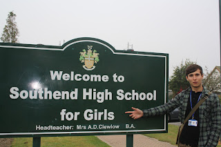
A Bad Image
Here is an Image that I am not pleased with. The background is dull and boring providing no sense of happiness or joy. The subject has a stupid expression on his face as if he is mocking the school, providing terrible representation for students. The flash reflection can be seen in the sign making the image look cheap and unprofessional. The photograph is landscape making it awkward and unconventional to be used on the front page. With the washed colours and depressing tone if it wasn't for the sign the image would represent a prison as opposed to a school (in which is meant to be advertised as a positive place).
Front Page Image
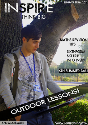
Here is the unedited photo that I intend to use. The bright lighting in the background not only gives the subject an angelic feel but gives connotations of happiness and good. These connotations could represent how the students feel in the school. The composition of the photo is good, the tree on the left provides a natural frame whilst keeping to the rule of thirds. The framing of the shot gets the subject,his book and bright light over his shoulder in shot. The angle of which the subject faces makes the image natural and aesthetic. The person is stylish wearing casual clothing and a fashionable bag, this makes him act as a model even though he is a student and in a school environment. He is leaning back on the tree with his hand in his pocket almost making him iconic showing that work is "cool". Overall this image contains many micro elements to create a macro sum (verisimilitude) of a positive front cover for a sixth form magazine.
Here is the edited version of the image. Using Photoshop I enhanced the colours and saturation and sharpened the image. I also cropped picture to make it a mid shot which is the conventional shot used for magazine covers. I carefully adjusted the levels and contrast to improve the image as much as possible.
Here is the edited version of the image. Using Photoshop I enhanced the colours and saturation and sharpened the image. I also cropped picture to make it a mid shot which is the conventional shot used for magazine covers. I carefully adjusted the levels and contrast to improve the image as much as possible.
Saturday, 1 October 2011
Mastheads
I am going to call my magazine "INSPIRE". This title is exciting and captivates the audiences' attention. The title can be applied to school work acting as an imperative to the students. "INSPIRE" has connotations of achievement and excitement showing representational qualities of a good student. The masthead appeals to the target audience of teenagers wondering what to do and looking for an interest and the niche audience of youths looking to get the most out of life.
This font is exciting and stands out. It has a modern feel and gives the impression of style and fashion savvy. Presenting a casual vibe it stays clear of associating with work which will appeal to the target audience.
This font would give the magazine a more sophisticated feel. It looks like it has been handwritten and has a feminine touch to it, however this could put off the male audience. The slightly more upmarket feel to this font would attract a more specific reader. The contents of the magazine (based on the font) would be intellectual and high cultured.
Subscribe to:
Comments (Atom)


